Li categories logos in 3:
- The Wordmark (Disney, Samsung, Coca Cola): a word designed to create a logo.
- Pictorial (Apple, Target, FedEx): a shape or picture and you identity what’s in the picture.
- Abstract Iconography (Nike, Pepsi, religious symbols): a shape or form that identifies the brand only with the importance you put into it. It’s not about the shape, but what they represent in the minds of people.
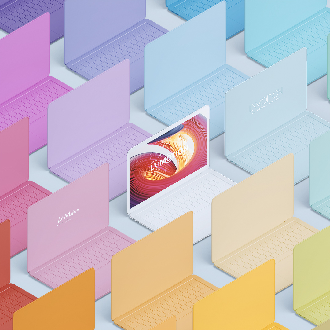
Finally, there’s actually a 4th category which can use elements from all 3 above: The Logo System. It’s a graphical framework with endless permutation. For example, MTV and Google’s daily doodles are familiar marks that change constantly pointing to other ideas or issues; they’re always on the trend. And that’s the unofficial logo of Li Motion.
It all has to do with technological change. Before a logo would represent a military emblem, it was a whole operation where one would print it on uniforms, equipments, cards. But nowadays, none of that is as important as an e-mail signature or your online avatar, they can be changed in a few seconds. So instead of identifying one or two constant colours, you can constantly switch up the theme. The logo won’t decide the branding, but the branding will decide the logo. As so, Li Motion doesn’t have a “one colour”, it’ll constantly change depending on the current public issues or adapt to any environnement. It’s the most complicated category, but it focuses on delivering great customer experience, that’s what will turn your customers into advocates.